Alastria has unveiled a new look, with a fresh logo that reflects who we are and the value we offer to our members, encapsulating everything Alastria stands for in a simple, straightforward and clear image.
Alastria is one of the largest public-permissioned, multi-sector blockchain platforms in the world today; a neutral meeting point for responsible, trusted and regulation-aligned knowledge generation, innovation and blockchain development in Europe.
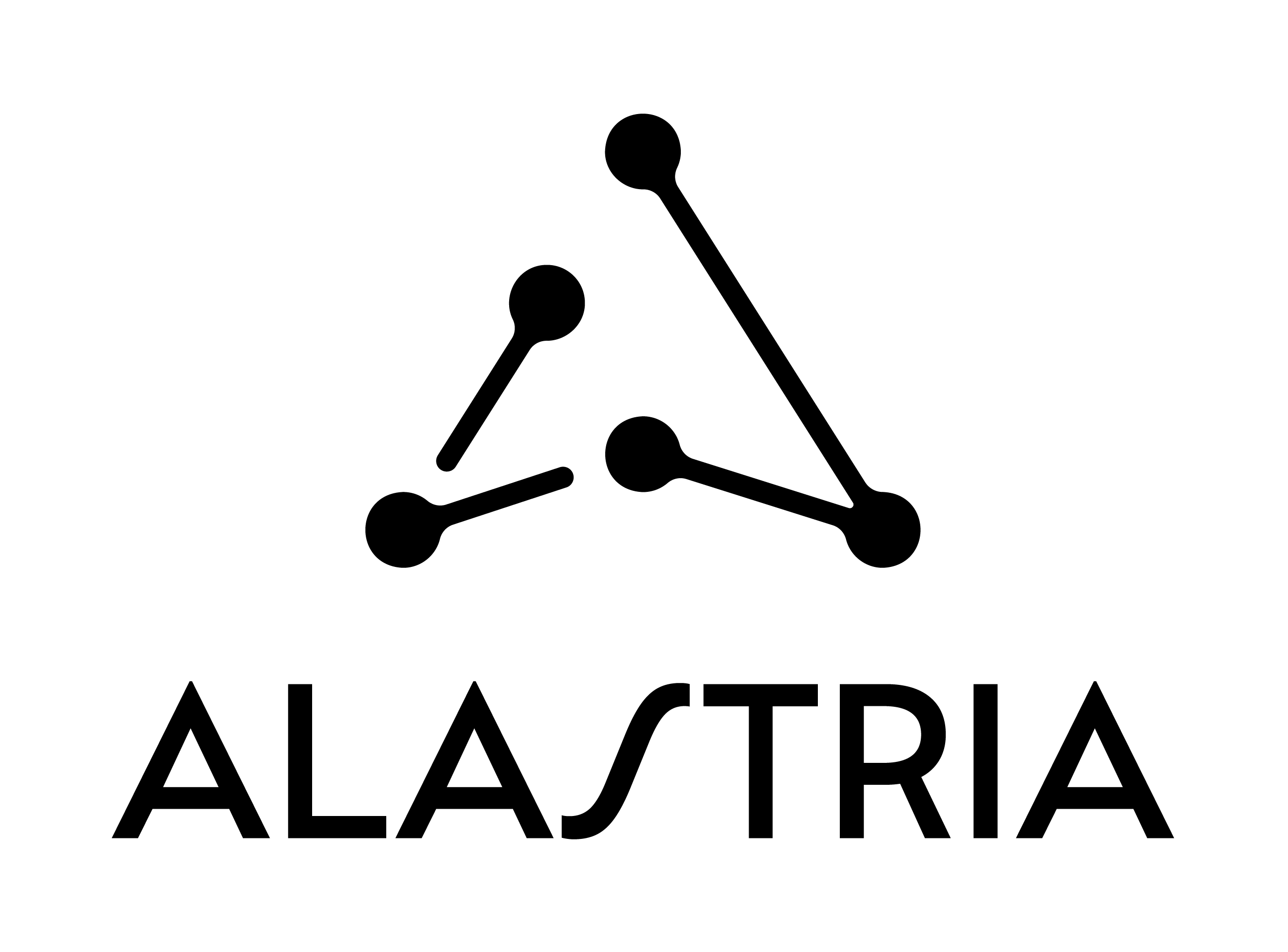
That is why our new logo alludes to a constellation (a symbolic one), which links to the origin of our name, the world of space and the connection to curiosity, innovation, technology and the future.
The figure’s shape is a guiding arrow, a depiction of Alastria as an industry leader that is blazing trails and accelerating the uptake of technology by supporting our members’ use cases.
Finally, the connecting points represent the ecosystem and network effect of blockchain. Alastria’s members are connected, creating opportunities for participation, experimentation and co-creation of platforms, resources, standards and guidelines related to DLTs.
The launch of the new logo (including new fonts, colours, and look and feel) is part of our evolution over the last few years and Alastria’s plan to improve its members’ experience on the digital channels and the way we engage with the ecosystem.
To carry out this repositioning strategy, we had the support of communications and digital marketing firm Incógnito.